During the Cubs home opener today, Chip Caray asked Steve Stone about his favorite Wrigley Field opening day memory. Prompted by me yelling “Tuffy!” from my chair, Steve said it was Karl “Tuffy” Rhodes hitting three home runs off Dwight Gooden in 1994. Hard to believe that was 10 years ago. No such luck for a similar memory today, with the wind blowing in.
Also, for the pregame show and the first inning, WGN’s graphics were being cut off on the sides of the picture, which is what happens when you haven’t paid enough attention to what’s going to happen when you downconvert your high-definition feed to standard definition. I blame the Superstation WGN technical crew in Tulsa, Oklahoma, and their weird “S” logo and incessant “Becker” promos. Maybe Cubs games should be letterboxed on the SD feed, although that might confuse all the elderly Cubs fans in Florida and Arizona who they’re always sending get-well wishes to during the broadcasts.
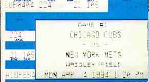
(Yes, unfortunately, my ticket stub really is that faded, even though it’s been in an envelope in a drawer for most of its life…and that’s with me trying to use some tricks in a graphics program to make the text a little more readable. Cheap ink: another example of Ticketmaster’s evilness.)
Original comments…
Luke, hanger-on: I’m not a big fan of the new WGN baseball graphics. The strip takes up a lot of screen space without passing along much information, plus it often lops off the top of a player’s head. Seems like in past years game data took up just a small corner of the screen — score, inning, tiny dots to denote the count — plus maybe a WGN watermark in another corner. I even seem to recall that cameramen at Wrigley put masking tape in the corner of their viewfinders to remind them to leave important action out of that corner when composing their shots.
Anyway, I’m keeping my eye out at the Tower. One of these days I’ll share an elevator with someone wearing a polo shirt with “WGN sports graphics” embroidered over the pocket, and I’ll refuse to let him off until he agrees to go back to the old design.
Jim: I don’t have a problem with the WGN strip, but maybe that’s because I’ve watched a lot of sports on Fox (football and baseball), inventor of the continuous on-screen score display and then the strip. In fact, I find WGN’s strip more aesthetically pleasing and somewhat easier to read than Fox’s. And the good thing about the strip is that the horrible “Superstation WGN” bug goes away when it’s on-screen.
The strip looked fine in the first inning, and I assume they use the same one in high-definition and standard definition, just with some “white space” on the ends in high-definition. The graphics that were getting cut off on the sides were the ones at the bottom of the screen, which I would call “lower thirds” if I were being pretentious about my radio/TV/film degree.
These days, the WGN cameramen are probably using masking tape (or vertical lines drawn with a Sharpie) in their high-definition viewfinders to show them where the edge of the picture is in standard definition.